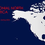
This was one of the earliest videos I made, originally for the American Environmental History class I taught (remotely) at UMass while I was still an ABD grad student, just about a decade ago. It was also one of the first videos I ever posted to YouTube, in an account that no longer even exists.
I wanted to insert it into the second chapter of my new text/course, which I’m getting ready to drop in the next few days (sorry for the delay! Once I’m in my new living space I’ll be able to focus much more on work). I had to search in my archival storage to find the file. Luckily, it was there and I didn’t have to make a new video.
Although we’re all familiar with the idea that the map is not the territory, I think it’s less obvious when we look at some modern maps that may seem to be incorporating the most recent information about national borders, city names, etc. It’s easy to see that the continents are a bit out of whack in the colored version of the 1507 Waldsemüller map above (this was the first map to call the “New World” continents America after the author of Mundus Novus who appears at the top). It’s much less obvious there’s something wrong with a Mercator Projection published in the 21st century. But there is.





Share this post